New multicolored highlights are here to make your Quip docs even more beautiful
Customers have often asked us for ways to make text more colorful, but we wanted to weigh the move thoughtfully; after all, Quip’s light, clean feel is important to us, and our users. We explored a few different ways to make text in Quip more colorful, looking for the sweet spot. Where we landed: a simple addition to the formatting menu that gives you a one-click way to highlight text, plus a handful of bright color options.
How to highlight
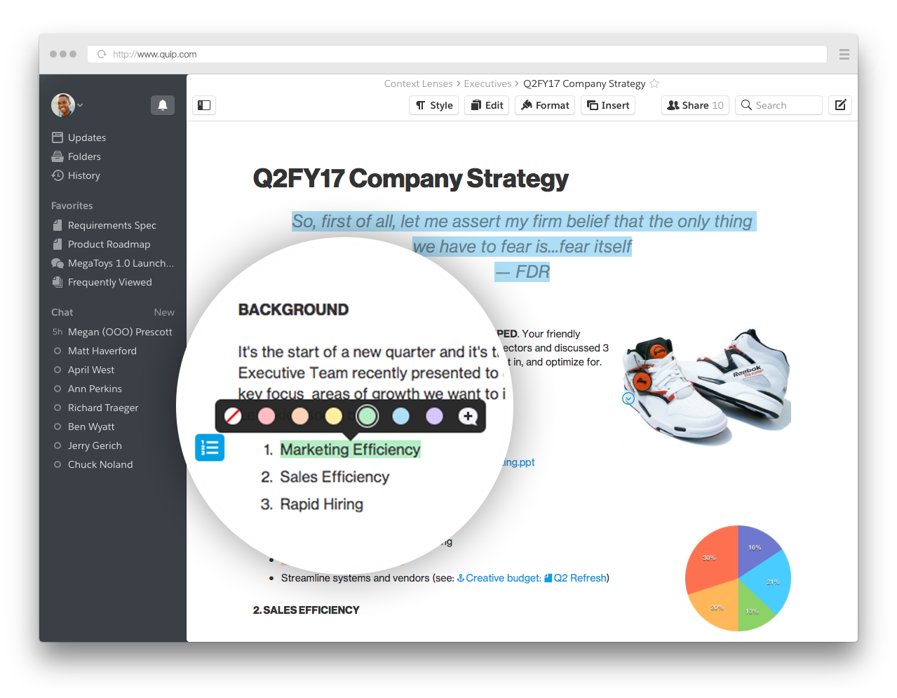
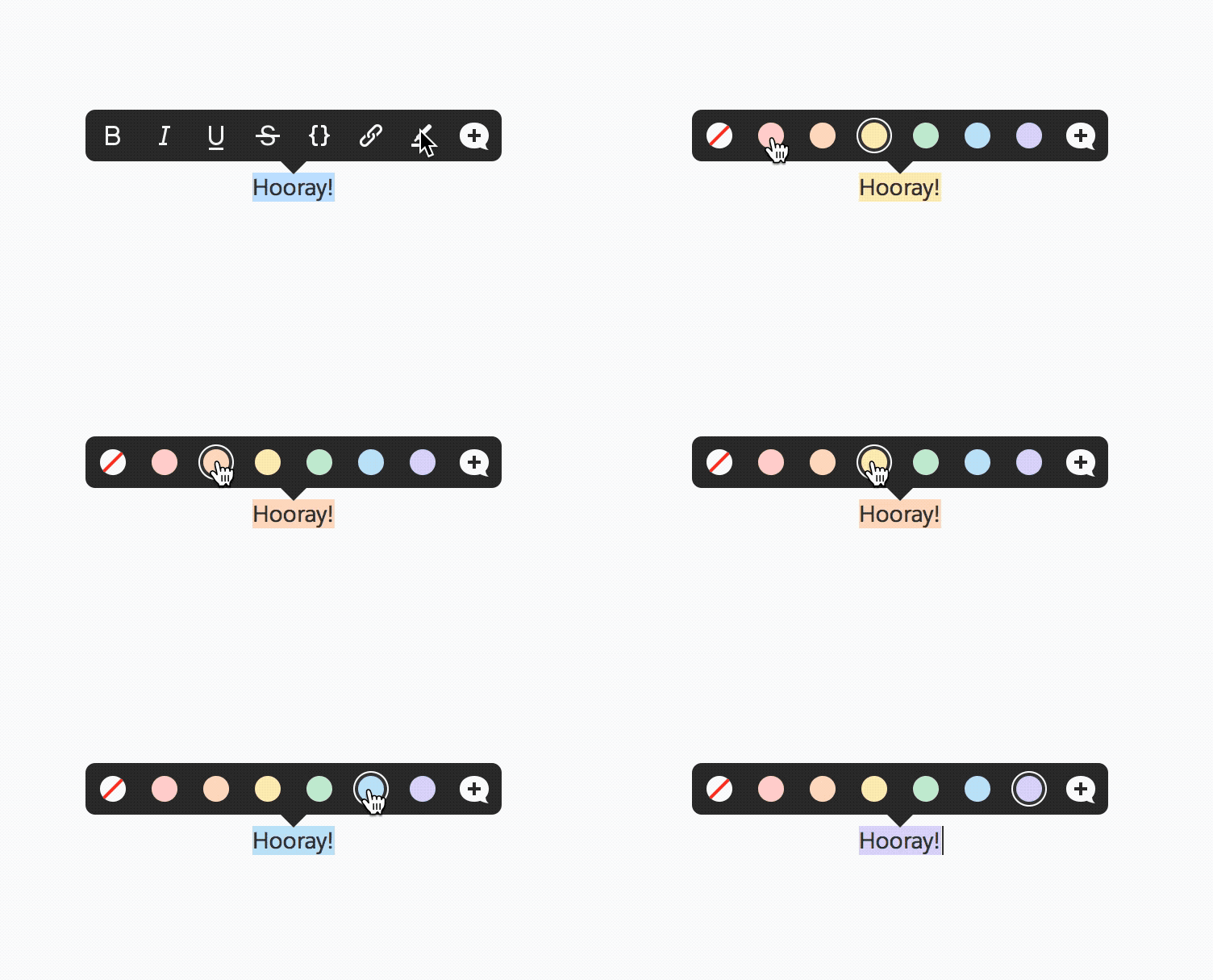
Here's how to do it: Select the text you want highlighted, then click the highlighter icon in the formatting menu that pops up. The highlight instantly defaults to yellow, but you can choose one of the other colors for your highlighted section. The menu stays visible until you exit it by clicking elsewhere in the document — this way, you can toggle between colors to see which one works best. From this menu, you can also click the + icon to add a comment.
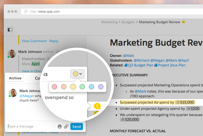
We've also added the ability to change the color of a comment-related highlight after the comment has been made. To do this, just open the comment and then click the color toggle in the upper right-hand corner.
To remove a highlight, click on the highlighted section to bring up the formatting menu. Then, click the white circle with the red line through it. This will remove any highlights that aren't associated with a comment. To keep comments from getting accidentally missed, we've made it so you can't actually remove a highlight that indicates a comment.
Communicate with color
Beyond the obvious application — making things pretty! — multicolored highlights introduce a whole new way to communicate inside your Quip documents. Here are a few ways to get started.
Emphasis
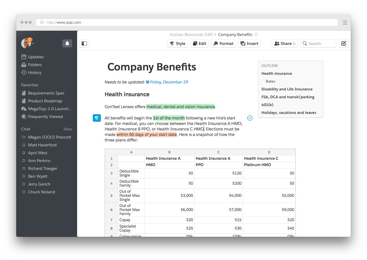
Use colorful highlights to draw attention to parts of your doc that you want people to see — or parts you want to revisit yourself. If you're sharing an on-boarding document with new employees, you can use green highlight to point out the most important facts. Or you could write up your interview notes in Quip, and use green highlight your most positive notes about the candidate, or really great things they said.
Color coding
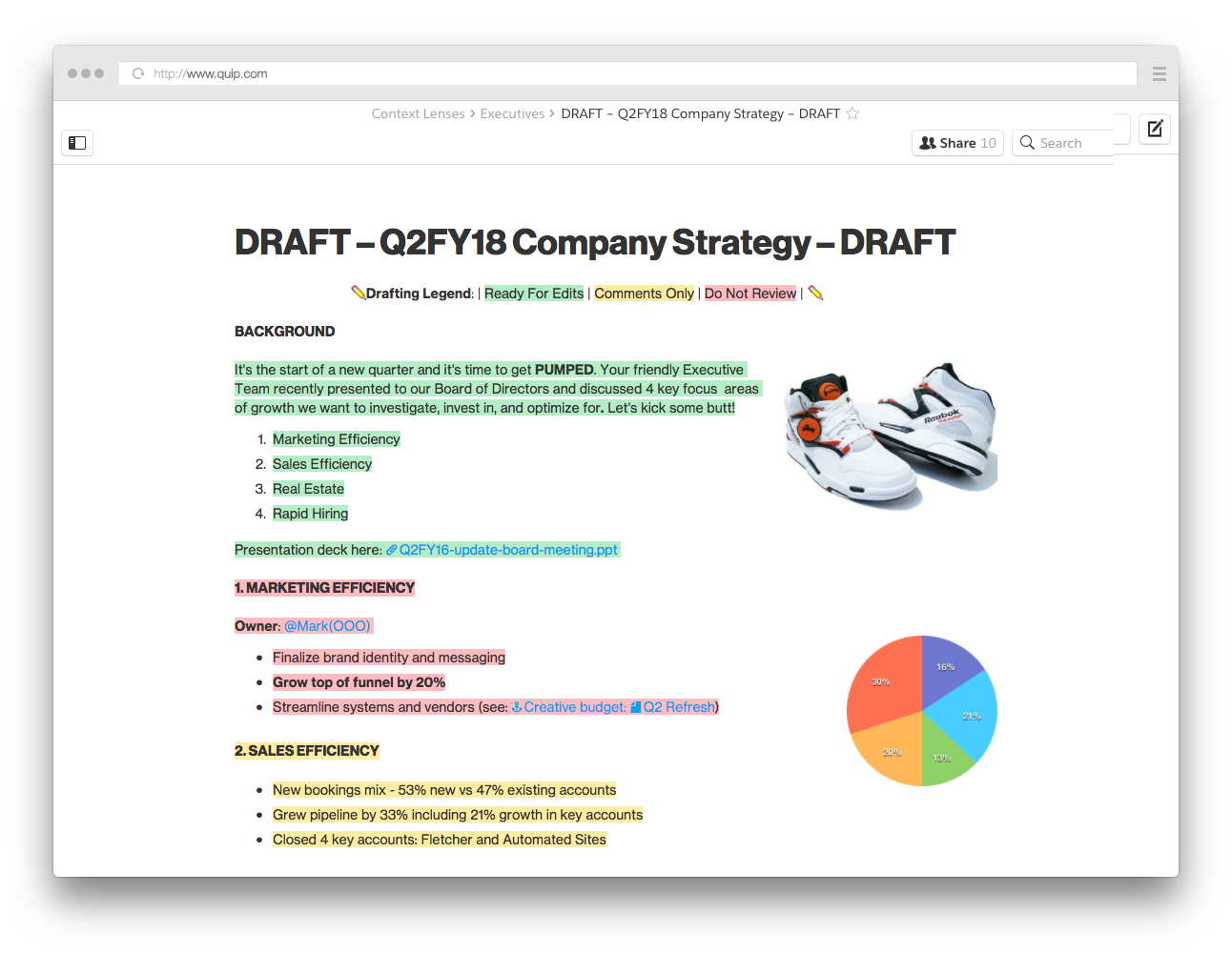
Color coding is great for sharing work that you need your team's input on, like an event plan or budget. Just share the doc, and include a “cheat sheet” at the top. You can use red to highlight areas that are still in progress, and aren't ready for feedback yet. Green could be “Ready for edits.” Yellow could indicate something like "Comments only, no edits.” You can color code for all kinds of things, like urgency, amount of time an issue has been open, cost relative to budget — anything, really.
Status
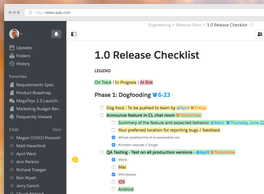
In checklists, using color is a fast, intuitive way to communicate status. You can use green for “on track” (and save strikethrough for “done.”) Yellow could be “in progress,” and red works well for “at risk” or “blocked.” This is great for individual task lists that you share with your manager, or lists where tasks are divided among an entire team.
Multicolored highlights are available on the web right now, and will be available on Mac and Windows desktop apps later this month. Go ahead and start adding some color to your living documents!
Get started today
Try Quip with your team now — create a free site in minutes.
