How to Make an Accessibility (a11y) Friendly Live App
Have you ever tried to blindfold yourself and navigate your website or app using only your keyboard and a screenreader? It’s hard! You might ask, “I’m not using it, so why would I care?” In fact, approximately 15% of the world population lives with some kind of disability or impairment. As a Live App developer, your efforts to make your app accessible can make assistive tool users’ lives much easier. This is some general guidance on how you can do so.
Keyboard Navigation
Navigation within the Live App
Make sure the interactive elements (such as controls, buttons, and links) in your app can be interacted with using a keyboard. Using correct semantic HTML can save you a lot of headaches.
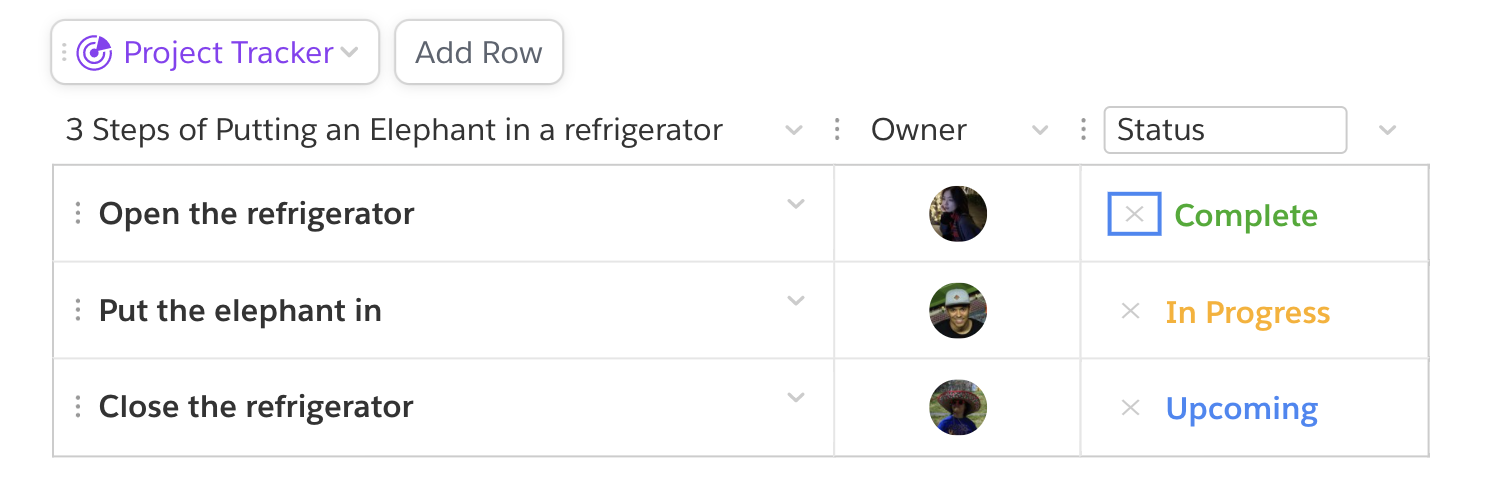
For example, in the Project Tracker Live App, clicking on the X icon will clear the status. Instead of using a simple <div> for the X icon, using a <button> will provide out-of-the-box keyboard interaction functionality (for example, you can use the Tab key to focus it) and a focus indicator (you can clearly see your keyboard focus is on the button).
<button
    aria-label={quiptext("Clear status")}
    className={styles.removeStatus}
    onClick={this.clearStatus}>
    <X strokeWidth={2} size={X_SIZE}/>
</button>
Navigate onto a Live App
The Live App platform provides the functionality for free! You can navigate onto a Live App using Tab or Up/Down arrow keys from the section above/below the Live App.
Navigate out of a Live App
To escape from a Live App, you can simply implement a keydown listener for Esc, and call quip.apps.exitApp. This API will send a bridge call from your Live App to the host and focus on the Live App container. From there you can use up/down arrows.
render() {
    return <div
            onKeyDown={e => {
                if (e.key === "Escape") {
                    if (quip.apps.isApiVersionAtLeast("0.1.052")) {
                        quip.apps.exitApp();
                    }
                }
            }}>
            <TableView/>
        </div>;
}
Use Color with Care
Always have focus indicators
A focus indicator is the outline/visual marker that indicates which element on a web page is focused.
 It is extremely important to help keyboard users recognize what elements they are interacting with. Make sure all the focusable elements will have one!
Color contrast
Good color contrast between the text and the text background is crucial for color blind and other visually impaired users. Quip is trying to meet the WCAG 2.1 AA standard for color contrast. Please consider meeting this standard for your app as well.
You can use the Contrast Ratio section of the Color Picker included in Chrome DevTools to check whether you meet the standard. One checkmark means that the element meets the minimum recommendation. Two checkmarks means that it meets the enhanced recommendation.
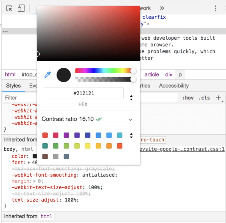
You can also try this online tool to make sure your color contrast is good to go!
Do not depend on color alone to convey information
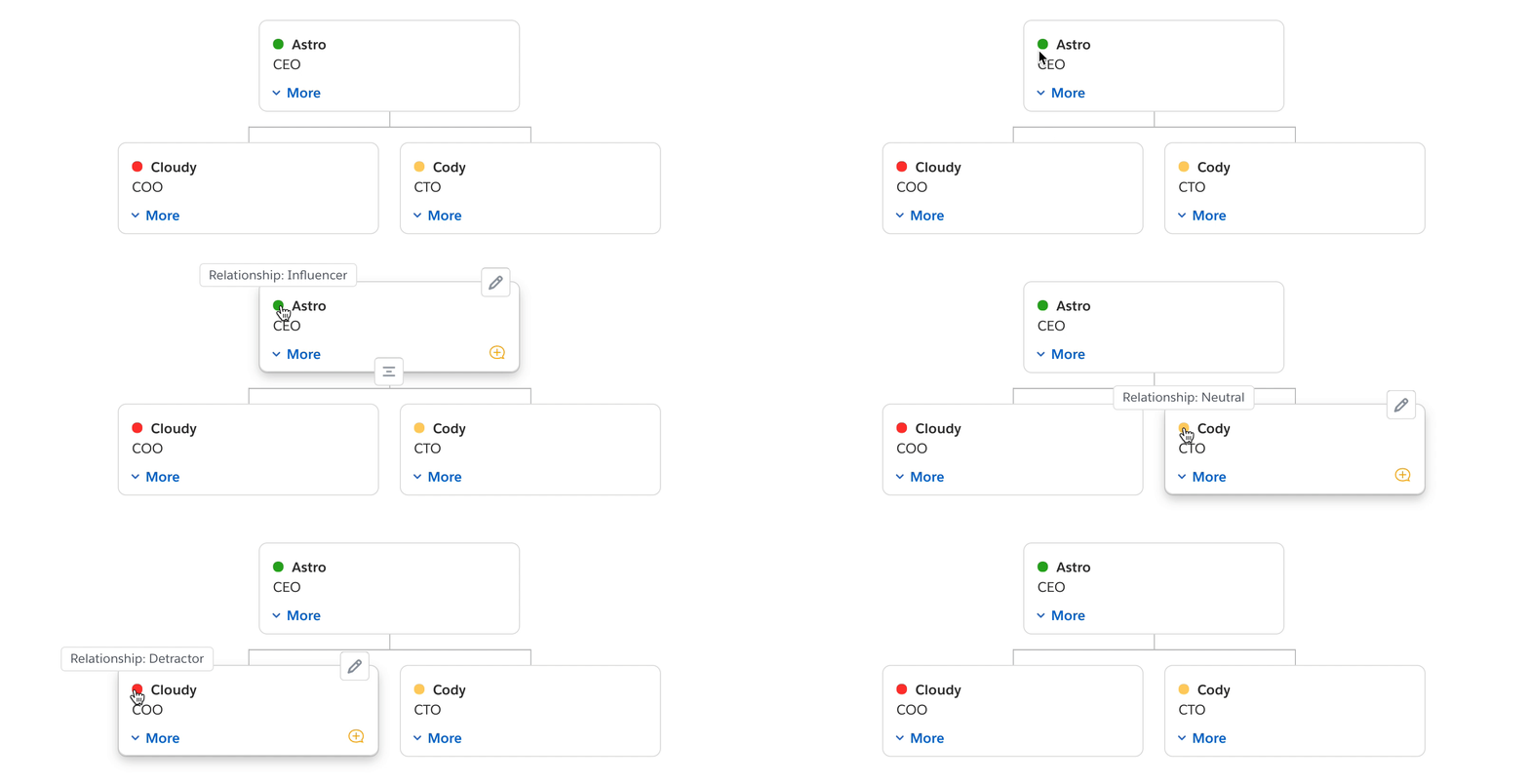
Colors are great. But your colors can be meaningless for color blind people. For example, in the Relationship Map Live App (RSM), each contact card can have a color-coded status to indicate the contact’s relationship. However, those color dots mean nothing to people who are color blind or those using a screen reader.
Here in RSM, we solved this problem by adding a tooltip for each color dot to describe what each color represents. There are other ways of conveying information. For example, you can add an aria-label HTML attribute to the component to provide information to screenreader users.
Since Quip now supports dark mode, is it possible to support dark mode for my Live App?
Yes you kind of can! You can enable use_color_theme in manifest.json for your Live App. When use_color_theme is True, it signals that the Live App would like to follow the color theme set from the main Quip app.
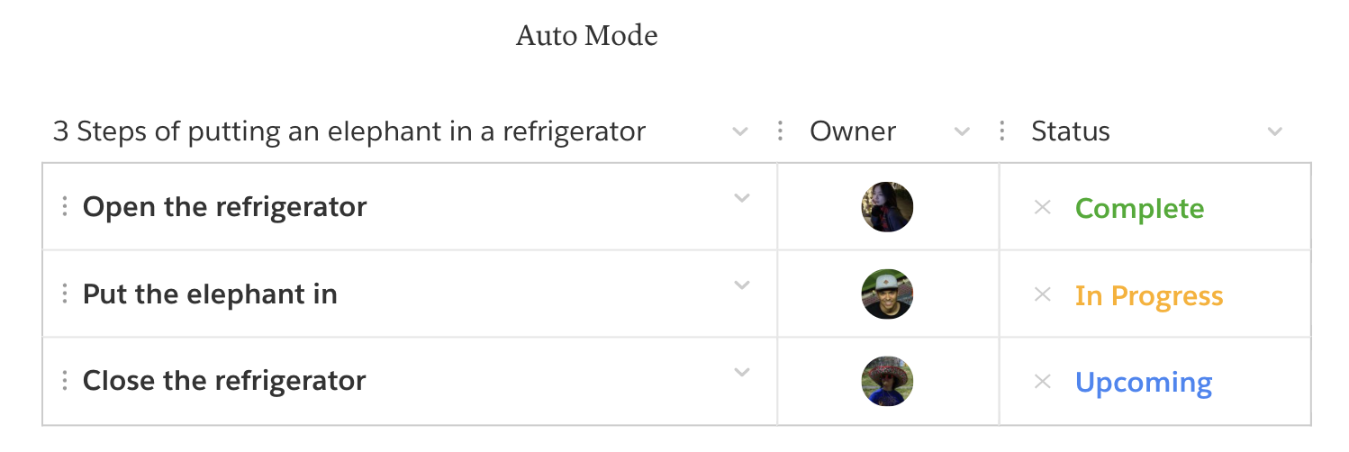
We highly recommend you use Quip colors, which have consistent semantic names, instead of your own hardcoded hex colors so that the Live App platform will smoothly integrate your Live App’s dark mode with the Quip document. The followings are the examples of how the Project Tracker Live App looks like in auto mode and dark mode.

Alright, I’ve done all of the above, then what...?
Test Your App
Congrats! Now your app can be interacted with using the keyboard and the color contrast looks great! How about trying to test it using a screenreader? Do all the buttons/images/icons sound reasonable to you when you navigate onto them?
 It’s very common that your app might have some icon buttons, just like the + button in the Project Tracker Live App shown below. By adding
 aria-label="Add User" to the button, the screen reader can convey more useful information about the action that will be triggered by the button instead of just reading out “button” to screen reader users.
There are many interaction patterns for which you may want to use ARIA roles and landmarks; check out WAI-ARIA Authoring Practices 1.1 for more good practices.
Besides testing your app with a screen reader, you can also verify what the a11y tree (the subset of the DOM consulted by screen readers) looks like using the Accessibility Chrome DevTool pane. Using this tool you can verify your element in the a11y tree, aria attributes, and the element's computed accessibility properties.
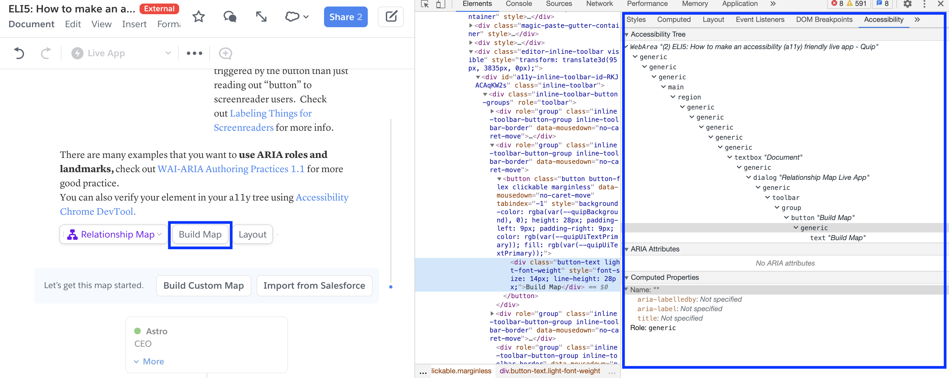
Check out more accessibility Chrome DevTool!
Congratulations! Now you become an a11y guru! Let's start making your Live App accessible!